

Today's Topic: Fabrics
Assignment: Pick the fabrics you will use in your quilt, and decide on fabric placement.
On the Blog: Write a blog post about it, sharing pictures of your fabric selection, and link it up using the link up at the end of this post. OR you can also link up photos from Flickr* or Instagram. (This is the same link up as on Monday's post, so feel free to share your coloring page designs AND fabric selections in this same link up.)
On Instagram: Complete the assignment (decide on your fabric selection), take a picture and tag it using hashtag #CelestialStarDesign AND #CelestialStarQAL.
**If you decide to work faster than my schedule, which is fine, be sure to take pictures along the way so you can come back and enter the different giveaways!
This weeks link up is sponsored by Pink Castle Fabrics!

They have graciously offered to giveaway two fat eight bundles! (Which is a perfect amount to create a large Celestial Star block with!) I will pick one winner from the link up on the blog, and one winner from the Instagram hashtag #CelestialStarDesign (so make sure you are tagging your photos!)

So pretty!!
Come back tomorrow to learn more about Pink Castle Fabrics and all the amazing events they have going on right now! You don't want to miss it!
I will announce the winner on Tuesday July 22nd, so you have just under a week left to come up with your design and fabric selection.
See this post for the schedule of posts so you don't miss any! :)
And that's it for the short version! Keep reading if you like, or start auditioning your fabrics! :)
First we'll discuss theory stuff, then I'll share my fabric pulls. I highly recommend checking that part out, as it will hopefully be helpful. :)
Let's Discuss Theory:
First lets convert what I talked about in Mondays post regarding color, to fabric. If you haven't read it yet, go read it! Then I don't have to repeat anything here, and you'll know what I'm talking about. ;)
When you really get into color, things can get pretty complex. When you talk about color in regards to fabric, it can become mind boggling. (That's how I feel anyway.) Color is color. Fabric can include multiple factors in one print. A single print can have: texture, value, and color schemes. If we want to assign a print to a single color and value category, how do we do that? It's all about reading a print. I will go through some basic classifications, since this is a QAL and not a novel. and because I'm still figuring all of this out myself. :)
Reading a Print:
Solids are the easiest. It's just like using paint chips. You have a color, or hue. There are light
Don't confuse color with value. Cool colors (blues, purples, greens) are not a dark value. Saturated reds and oranges (warm colors) can appear lighter because they are bright, but can actually be darker in value than the "darker" cool colors.
Here are a few solids (on the left) and prints that read as solids (on the right). Classic examples are the sketch prints, quilters linen, anything that has texture with minimal contrast in color or value. The pink on the right could maybe read as a solid, or a tone-on-white (see below). What do you think?

Next up are "tone on tones". In color theory Tone is hue (color) + grey, which is not the definition when referring to fabric. Tone on Tone is a hue that has a design created with varying value(s) of the same hue. I often see the pattern lighter than the overall print, though that is definitely not the rule, as seen below. lol. Denyse Schmidt is a rock star at tone-on-tone prints and often includes many in her collections.

Another common classification is Tone on White. These are prints that are created, usually, with a single hue and white. They can be made up mostly of the hue (which would tend to make for a darker value, depending on the value of the hue used), or mostly of white. I often see tone on white prints that are mostly white, in a lot of the low volume bundles that a lot of shops have been creating (which are really low value if you want to be technical about it). Lots of white = low value, even if the hue it is combined with is dark (though this can make it tricky).

Multi-color Prints:
It gets more complicated with multi-color prints. So let's start with the easy stuff. Small prints tend to read a specific color. (I'm ignoring prints that are every color of the rainbow, or are equal amounts of different colors).

The yellow honeycomb has orange lines, but this reads as a very strong yellow. The other three are easily catagroized as cool colors, but their exact color can depend on how you are using it. The Joel Dewberry Print (second from the right) is an interesting example for value. The greens are light in value, but the teals are much darker. I'm not giving you the answer as how to use this, as I think it would have different results depending on what it is paired with. But these are things to consider as you choose your fabrics. And this is why I find color in fabric tricky.
The larger the scale of the design, the more complicated it can be. Now you have to start using your own judgement as to what the majority of the colors read, is there a lot of negative space? Is it light or dark? etc. If you are using it in a large area, that also makes a different compared to using only a square inch of it, which means you would only need to evaluate that inch of the fabric.

How is this for a generic random picture? The center one on the bottom is more cool colors and reads more blue/green (A good example of a small scale print and how it more easily reads a specific color). The Cups are multiple prints, but the background is a strong yellow. If you are using this in a large area, it could easily read yellow. If you are fussy cutting individual cups or designs, that changes what it would be classified as. The Lizzy House print in the upper right corner looks orange because there are so many orange items, but this also depends of how much of the print you are using. The Anna Maria Horner print on the left is an example of a very large scale print. How would you classify this one one the color wheel and value scale?
If you are having trouble distinguishing - squint your eyes (this works wonders!), take a blurry picture, for value, take a black and white photo (or if using a photo editing tool such as iPhoto, or your phone, simply turn the saturation all the way down to zero). Which prints look darker, which are lighter?
Unity and Variety:
One more thing to consider: UNITY and VARIETY. Consider how you balance using similar styles of prints in your block to create unity (multiple tone-on-tone prints), and how you use different styles of prints to add variety (solids mixed with multi-color prints, large scale prints and small scale tone-on-white).
A good balance between unity and variety is another factor to creating a strong design. Too much variety = busyness. There is no place for your eye to rest. The same is true with busy prints themselves, a print that has a lot of variety in it. Surround busy prints with more *boring* prints to help rest your eye within the block. Even if you have a lot of color contrast and a lot of value contrast, if all of your prints are really busy, that can detract from your overall design. **I am saying this in regards to the Celestial Star block only, or a block that has a specific pattern. Variety and busy prints can be successfully executed in other types of quilts, so take this at face value, as all rules can be successfully bent and manipulated.
And now I'll stop.
My Layout:
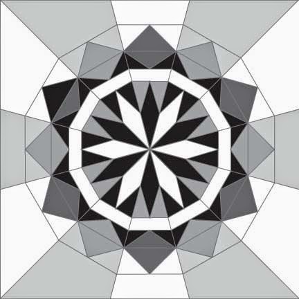
I am really enjoying looking at everyone's design pictures on Instagram and in the blog link up. A few of the pictures inspired me to create my final designs in black and white. I was feeling a bit overwhelmed trying to balance design and color at the same time. This turned out to be a great way to fine tune the designs and simplify the number of decisions to make.

Next I added value to add contrast and make the designs POP more (adding depth and interest).

At the end of Mondays post I shared about adding variation in value to cause interest in a design. Let's compare my two layouts side by side, the black and white version and the version with value added.

Notice how adding different values makes the blocks POP! It goes from a flat design to one with depth. Neither is wrong, but adding value on purpose can add a lot to your design. And doing it on purpose will also ensure that your designs are balanced.
Small tangent: The black and white is definitely cool. And would be fantastic in purely solids, for example, adding in a single value of different colors. I.e. this split-complimentary (not exactly, but close to) color scheme:

I can image Faith Jones of Fresh Lemons Quilts or Katie of From The Blue Chair making a quilt like this. They are great at using solids!
For my quilt I am using my Anna Maria Horner stash,
Here is my stash divided up:

Here is the same picture in Black and White. Notice how you can see the value scale. It is not perfect, but I feel good about how I've grouped the fabrics:

My Fabric Selection:

Here are the fabrics I've chosen for each block. I HIGHLY RECOMMEND TAKING LOTS OF REFERENCE PHOTOS during this process. Below I will share each block, the stack of fabric I will be using in that block, as well as a picture of my fabrics laid out in relation to where I'll place them in the pattern (this will be invaluable to help me know how/where I plan to use the fabrics). I'll also share the black and white of each pile so you can see how value applies to the fabrics. Other things to look at: color schemes, how I combined warm and cool colors, unity and variety in print styles, etc. Yes, go ahead and critique. I'm sure they aren't perfect, but I feel pretty good about them for now.


Some of these are more rainbowy than others, and some are bolder color combinations than others, so I might change these around after making a few blocks. Because I'm making 12 blocks, having variations in the blocks regarding contrast, boldness, and hue can add interest to my quilt, or make it uneven, or weird. So many things to consider. ;)
I hope this has helped!! I hope you will not feel too overwhelmed with choosing your fabrics, and leave you feeling confident in creating a block that will turn out just how you want it to!
Be sure to share your fabric selections and link them up, along with your coloring pages. You can share them together or separately. Each entry will enter you into the giveaway! You have until Monday night to link up! :)

I love the black and white look too! Except it's amazing how much better it gets when you change the values up a bit. Wow!!
ReplyDeleteSeeing your potential layouts in just BW really got me excited about this project. Because I don't love paper piecing, I wasn't planning on joining your QAL, but I really love how these look--especially the one you mentioned Faith or I might like. It made me laugh because as soon as I saw that image, my immediate reaction was, "Ooh, I like that one!" Then I saw your comment. I think you might have sucked me into joining. :) Your patterns are truly beautiful, but I especially love all the variations you have provided with this pattern. Great work Diane! I'm always in awe of the amazing blocks you create!
ReplyDelete